11. Matplotlib plot json
Matplotlib can be used to draw a graph of json data from the web.
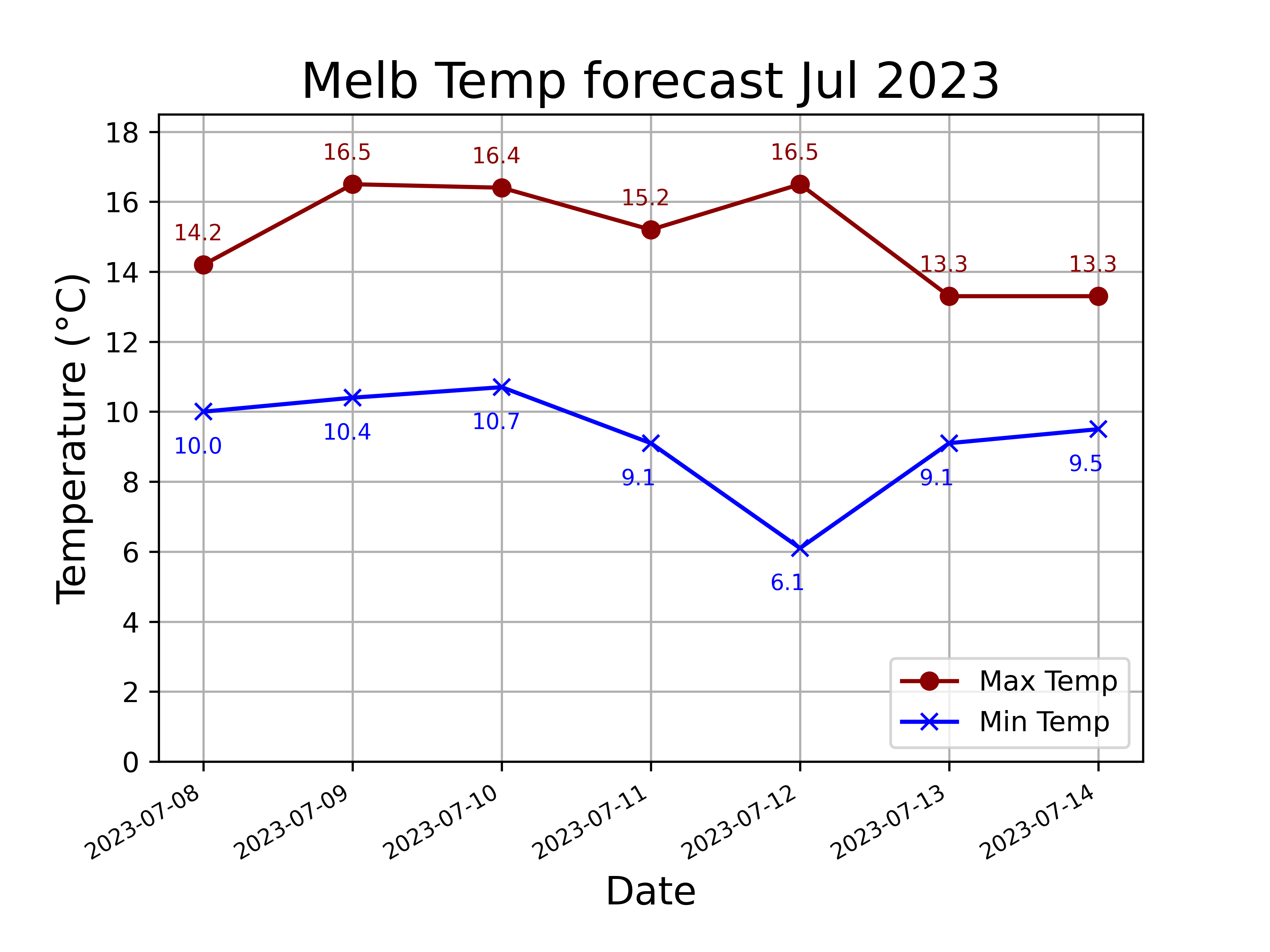
11.1. Temperature forecast
11.2. Python code
The python code is below.
The code is commented to indicate what each part is doing.
 1
 2import numpy as np
 3import matplotlib.pyplot as plt
 4import json
 5from urllib.request import urlopen
 6from datetime import datetime, timedelta
 7from pathlib import Path
 8
 9
10def plot_weather_temperatures(title, url):
11    """Plots the weather data from the given url and gives it the given title.
12
13    Args:
14        title (str): The title of the plot.
15        url (str): The url of the API that provides weather data.
16
17    Returns:
18        None
19    """
20    # Open the URL and read its content
21    with urlopen(url) as response:
22        source = response.read()
23    # Load the content as a JSON object
24    data = json.loads(source)
25    # Extract the list of dates from the "daily" key of the JSON object
26    dates_list = data["daily"]["time"]
27    # Extract the list of maximum temperatures from the "daily" key of the JSON object
28    tmax = data["daily"]["temperature_2m_max"]
29    # Extract the list of minimum temperatures from the "daily" key of the JSON object
30    tmin = data["daily"]["temperature_2m_min"]
31    # Convert the dates in dates_list to datetime objects
32    dates_list = [datetime.strptime(date, "%Y-%m-%d") for date in dates_list]
33    # plot lines with x, y, colour, markers, labels for legend
34    plt.plot(dates_list, tmax, color='darkred', marker='o', label = "Max Temp")
35    plt.plot(dates_list, tmin, color='blue', marker='x', label = "Min Temp")
36    # Set the offset values for the x and y coordinates of the temperature labels
37    x_offset = timedelta(days=0.2)
38    max_offset = 0.7
39    min_offset = -1.2
40    # Label the maximum temperatures
41    for x, y in zip(dates_list, tmax):
42        plt.text(x - x_offset, y + max_offset, f"{y:.1f}", color="darkred", fontsize=8)
43    # Label the minimum temperatures
44    for x, y in zip(dates_list, tmin):
45        plt.text(x - x_offset, y + min_offset, f"{y:.1f}", color="blue", fontsize=8)
46    # Set the bottom limit of the y-axis to the minimum of 0 and 2 units below the minimum temperature,
47    # and set the top limit of the y-axis to 2 units above the maximum temperature
48    plt.ylim(bottom=min(0, min(tmin) - 2), top=max(tmax) + 2)
49    # Set the y ticks to be every 2 units
50    ymin = min(0, min(tmin) - 2)
51    ymax = max(tmax) + 2
52    plt.yticks(np.arange(ymin, ymax, 2))
53    # format dates so they are angled to fit
54    plt.gcf().autofmt_xdate()
55    # Set the font size of the x-axis labels to 10 points
56    plt.tick_params(axis='x', labelsize=8)
57    # add a grid
58    plt.grid(True)
59    # add axis title labels
60    plt.xlabel('Date', fontsize=14)
61    # \N{DEGREE SIGN} si the escape sequence for unicode name for the degree symbol
62    plt.ylabel('Temperature (\N{DEGREE SIGN}C)', fontsize=14)
63    # add plot title
64    plt.title(title,fontsize=18)
65    # place legend at lower right
66    plt.legend(loc="lower right")
67    # Get the directory of the current file
68    currfile_dir = Path(__file__).parent
69    # Replace spaces in title with underscores to create filename for saving figure
70    filename = title.replace(" ", "_")
71    # build the image file path
72    filepath = currfile_dir / (f"{filename}.png")
73    # Save figure (dpi 300 is good when saving so graph has high resolution)
74    plt.savefig(filepath, dpi=600)
75    # Show plot
76    plt.show()
77
78
79def plot_melb_temp_7day():
80    url = "https://api.open-meteo.com/v1/forecast?latitude=-37.81&longitude=144.96&daily=temperature_2m_max,temperature_2m_min&timezone=Australia%2FSydney"
81    title = "Melb Temp forecast Jul 2023"
82    plot_weather_temperatures(title, url)
83
84
85if __name__ == '__main__':
86    plot_melb_temp_7day()