7. Matplotlib pie chart
Matplotlib can be used to draw a pie chart.
By default, the plotting of the first wedge starts from the x-axis and moves counterclockwise.
The size of each wedge is determined by comparing the value with all the other values, by using this formula: the value divided by the sum of all values: x/sum(x)
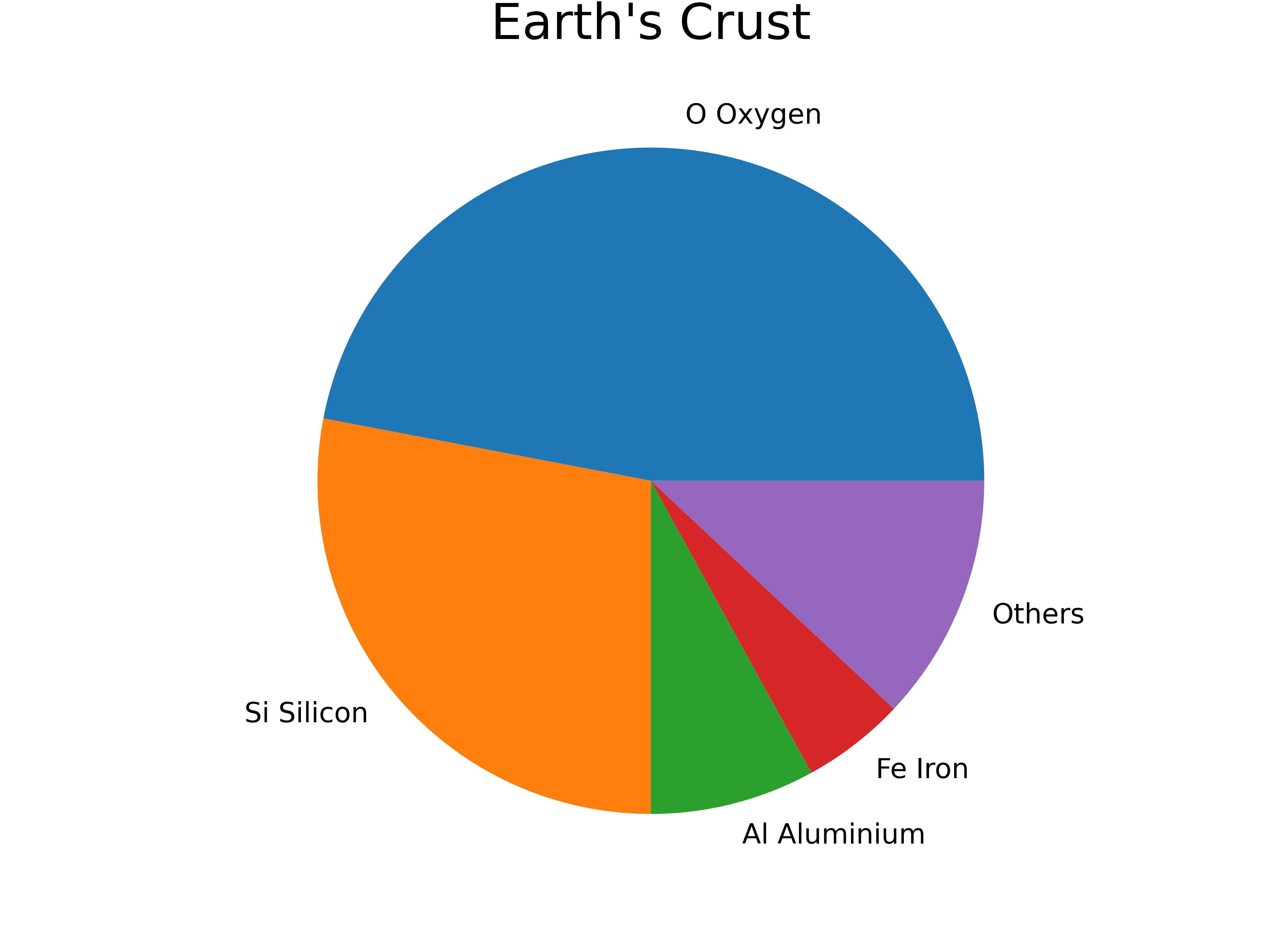
7.1. Simple pie chart
This is a simple pie chart.
7.2. Python code
The python code is below.
The code is commented to indicate what each part is doing.
 1import matplotlib.pyplot as plt
 2
 3
 4def plot_pie_chart(data, labels, title):
 5    # Plot the pie chart with the given data, labels, and formatting options
 6    plt.pie(data, labels=labels)
 7    # Set the aspect ratio of the plot to be equal
 8    plt.axis('equal')
 9    # Add a title to the plot
10    plt.title(title, y=1.08, size=18)
11    # Show plot
12    plt.show()
13
14
15def earth_elements():
16    # Data to plot
17    data = [47, 28, 8, 5, 12]
18    # Labels for each wedge of the pie chart
19    labels = ['O Oxygen', 'Si Silicon', 'Al Aluminium', 'Fe Iron', 'Others']
20    # Title for plot and filename for saving figure
21    title = "Earth's Crust"
22    # Call the function to plot the data with given data, labels, title and full_labels
23    plot_pie_chart(data, labels, title)
24
25
26if __name__ == '__main__':
27    earth_elements()
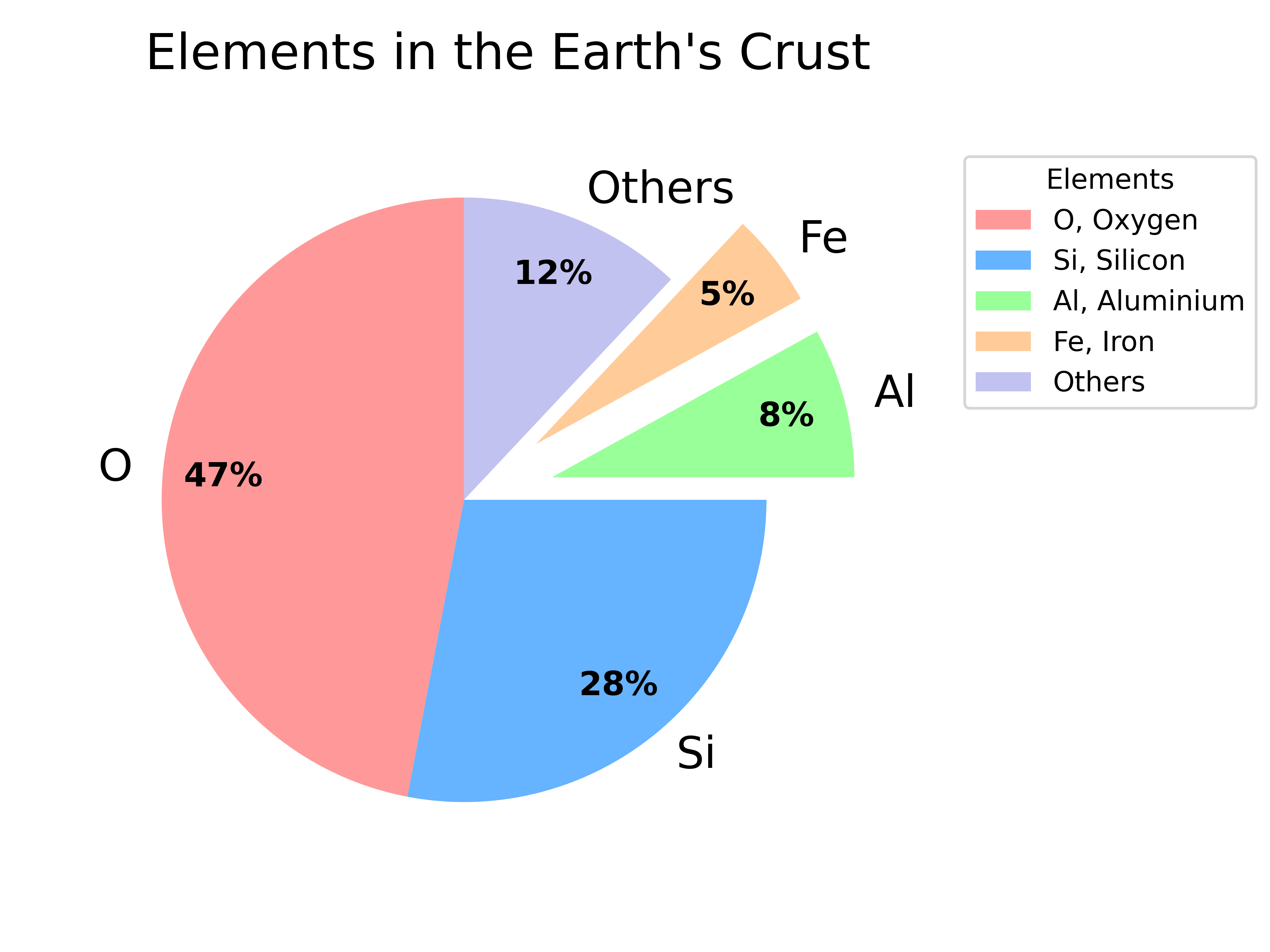
7.3. Customized pie chart
This plot has more customizations added.
It has code to save the pie chart as a png file.
7.4. Python code
The python code is below.
The code is commented to indicate what each part is doing.
 1import matplotlib.pyplot as plt
 2import numpy as np
 3from pathlib import Path
 4
 5
 6def plot_pie_chart(data, labels, full_labels, title):
 7    # Create a list of values to determine how far each wedge of the pie chart should be offset from the center
 8    explode = [0 if x > 8 else 0.3 for x in data]
 9    # Define the colors to use for the pie chart
10    colors = ['#ff9999', '#66b3ff', '#99ff99', '#ffcc99', '#c2c2f0']
11    # Plot the pie chart with the given data, labels, and formatting options
12    wedges, texts, autotexts = plt.pie(data, labels=labels, autopct=lambda pct: f"{pct:.0f}%", explode=explode, pctdistance=0.8, colors=colors, startangle = 90)
13    # Set the font size  for the data labels
14    plt.setp(texts, size=16)
15    # Set the font size and weight for the data labels
16    plt.setp(autotexts, size=12, weight="bold")
17    # Set the aspect ratio of the plot to be equal
18    plt.axis('equal')
19    # Add some space around the plot
20    plt.subplots_adjust(left=0.1, right=0.70, top=0.85, bottom=0.1)
21    # Add a title to the plot
22    plt.title(title, y=1.08, size=18)
23    # Add a legend to the plot using the given full_labels and colors from the pie chart
24    plt.legend(wedges, full_labels, title="Elements", loc="upper right", bbox_to_anchor=(1, 0, 0.5, 1))
25    # Get the directory of the current file
26    currfile_dir = Path(__file__).parent
27    # Replace spaces in title with underscores to create filename for saving figure
28    filename = title.replace(" ", "_")
29    # build the image file path
30    filepath = currfile_dir / (f"{filename}.png")
31    # Save figure (dpi 300 is good when saving so graph has high resolution)
32    plt.savefig(filepath, dpi=600)
33    # Show plot
34    plt.show()
35
36
37def earth_elements():
38    # Data to plot
39    data = [47, 28, 8, 5, 12]
40    # Labels for each wedge of the pie chart
41    labels = ['O', 'Si', 'Al', 'Fe', 'Others']
42    # Full labels for legend
43    full_labels = ['O, Oxygen', 'Si, Silicon', 'Al, Aluminium', 'Fe, Iron', 'Others']
44    # Title for plot and filename for saving figure
45    title = "Elements in the Earth's Crust"
46    # Call the function to plot the data with given data, labels, title and full_labels
47    plot_pie_chart(data, labels, full_labels, title)
48
49
50
51if __name__ == '__main__':
52    earth_elements()