8. Matplotlib pie chart csv
Matplotlib can be used to draw a pie chart using csv data.
8.1. Python code
The python code is below.
The code is heavily commented to indicate what each part is doing.
1import matplotlib.pyplot as plt
2import numpy as np
3import pandas as pd
4from pathlib import Path
5
6
7def plot_pie_chart(data, labels, full_labels, title):
8 # Define the colors to use for the pie chart
9 colors = colors=[plt.cm.tab20(i) for i in range(20)] # plt.cm.rainbow(np.linspace(0, 1, 20))
10 # Create a figure object with a size of 10 by 10 inches
11 plt.figure(figsize=(8, 8))
12 # Plot the pie chart with the given data, labels, and formatting options
13 wedges, texts, autotexts = plt.pie(data, labels=labels, autopct=lambda pct: f"{pct:.1f}%" if pct >= 2 else f"{pct:.2f}%", pctdistance=1.1, labeldistance=1.22, startangle = 270, colors=colors, radius=1.5)
14 # Set the font size and color for the data
15 plt.setp(texts, size=14, color='k')
16 # Set the font size and color for the data labels
17 plt.setp(autotexts, size=10, color='k')
18 # Set the aspect ratio of the plot to be equal
19 plt.axis('equal')
20 # Add some space around the plot
21 plt.subplots_adjust(left=0.1, right=0.70, top=0.85, bottom=0.1)
22 # Add a title to the plot
23 plt.title(title, y=1.08, size=18)
24 # Add a legend to the plot using the given full_labels and colors from the pie chart
25 plt.legend(wedges, full_labels, title="Elements", loc="upper right", bbox_to_anchor=(1, 0, 0.5, 1))
26 # Adjust the label for the last wedge by using the last text object in texts
27 last_text = texts[-1]
28 # Get the current position of the last text object
29 x, y = last_text.get_position()
30 # Add a small amount to the x and y coordinates
31 x += 0.4
32 y += 0.0
33 # Set the new position of the last text object
34 last_text.set_position((x,y))
35 last_text.set_size(12) # Set the font size to 10
36 # Get the directory of the current file
37 currfile_dir = Path(__file__).parent
38 # Replace spaces in title with underscores to create filename for saving figure
39 filename = title.replace(" ", "_")
40 # build the image file path
41 filepath = currfile_dir / (f"{filename}.png")
42 # Save figure (dpi 300 is good when saving so graph has high resolution)
43 plt.savefig(filepath, dpi=600)
44 # Show plot
45 plt.show()
46
47
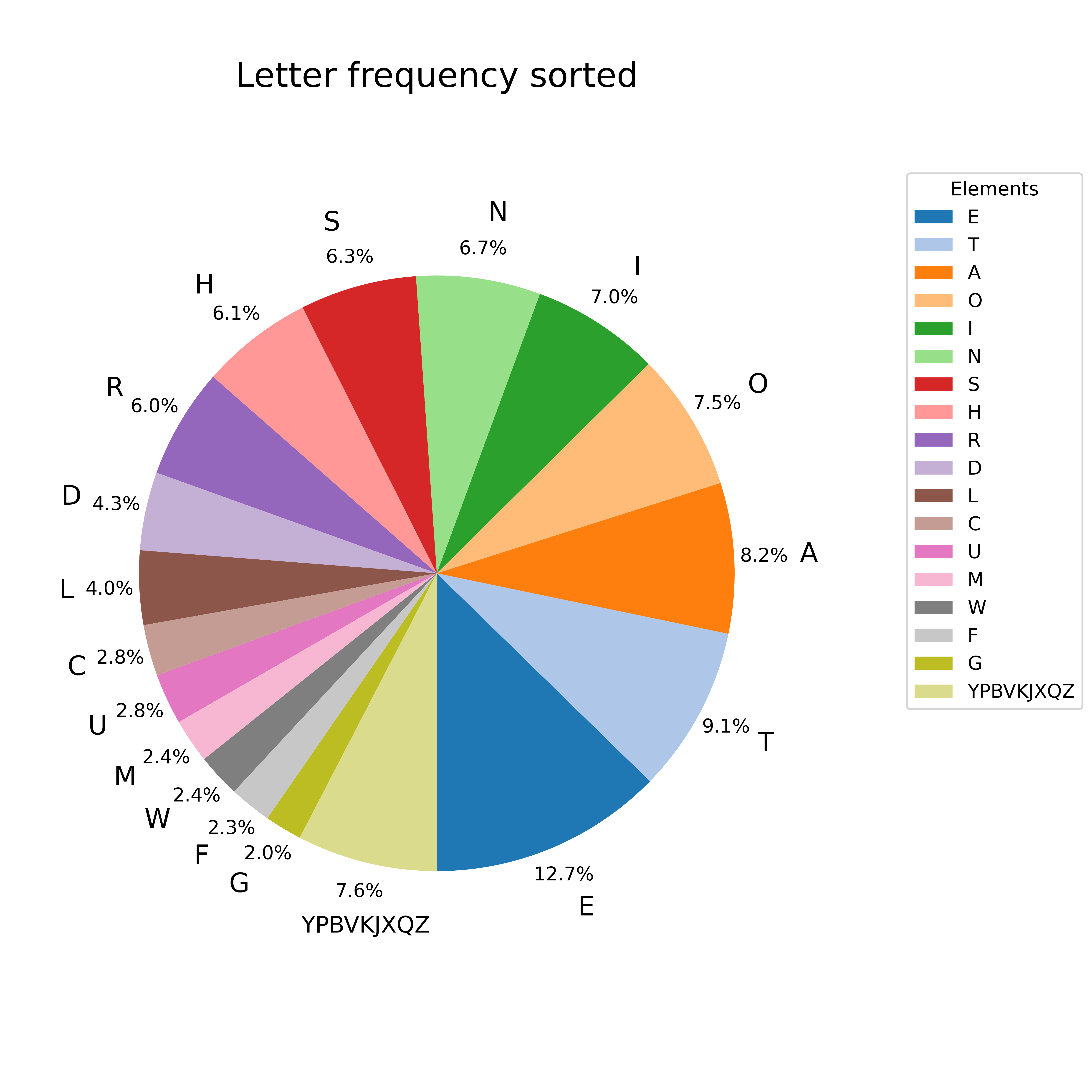
48def letters_usage_sorted():
49 currfile_dir = Path(__file__).parent# Replace spaces in title with underscores to create filename for saving figure
50 filepath = currfile_dir / 'letter_frequency.csv'
51 # Read data from csv file into pandas dataframe.
52 data = pd.read_csv(filepath)
53 # Sort data by frequency column in descending order.
54 data.sort_values(by='frequency', ascending=False, inplace=True)
55 # Extract letters and frequency values from dataframe.
56 letters = data['letter']
57 values = data['frequency'] * 100
58 # Initialize lists to store filtered letters and values.
59 filtered_letters = []
60 filtered_values = []
61 other_letters = []
62 other_value = 0
63 # Iterate over letters and values.
64 for letter, value in zip(letters, values):
65 if value > 2:
66 filtered_letters.append(letter)
67 filtered_values.append(value)
68 else:
69 other_letters.append(letter)
70 other_value += value
71 # Join the other letters and add the other wedge to the filtered data.
72 other_label = "".join(other_letters)
73 filtered_letters.append(other_label)
74 filtered_values.append(other_value)
75 # Data to plot.
76 data = filtered_values
77 # Labels for each wedge of the pie chart.
78 labels = filtered_letters
79 # Full labels for legend.
80 full_labels = filtered_letters
81 # Title for plot and filename for saving figure.
82 title = "Letter frequency sorted"
83 # Call the function to plot the data with given data, labels, title and full_labels.
84 plot_pie_chart(data, labels, full_labels, title)
85
86
87if __name__ == '__main__':
88 letters_usage_sorted()